

When Bold Comes Knocking: Front Door Colors That Make a Statement
/It’s the best time of year- time to bake some pies, grab your stretchiest pants (I’m talking Joey in Phoebe’s maternity pants) and pack up the car to grandmother’s house we go. During the drive, my annual reflection of how many glasses of wine is deemed “socially acceptable” at family dinner is suddenly interrupted by all the beautiful homes and their front doors decorated for the holiday season.
But it’s not the doors with the most festive fall wreaths that grab my attention, but rather the doors whose owners have defied status quo to paint them in beautiful bold colors. It’s crazy how painting a door can be so easy to do and yet make such a statement. I personally love it when our West End clients are willing to take a walk on the wild side of bold colors. So if your front door is just begging to be dolled up with a splash of paint, here are some #doortraits I found that spoke to me along with some paint recommendations.
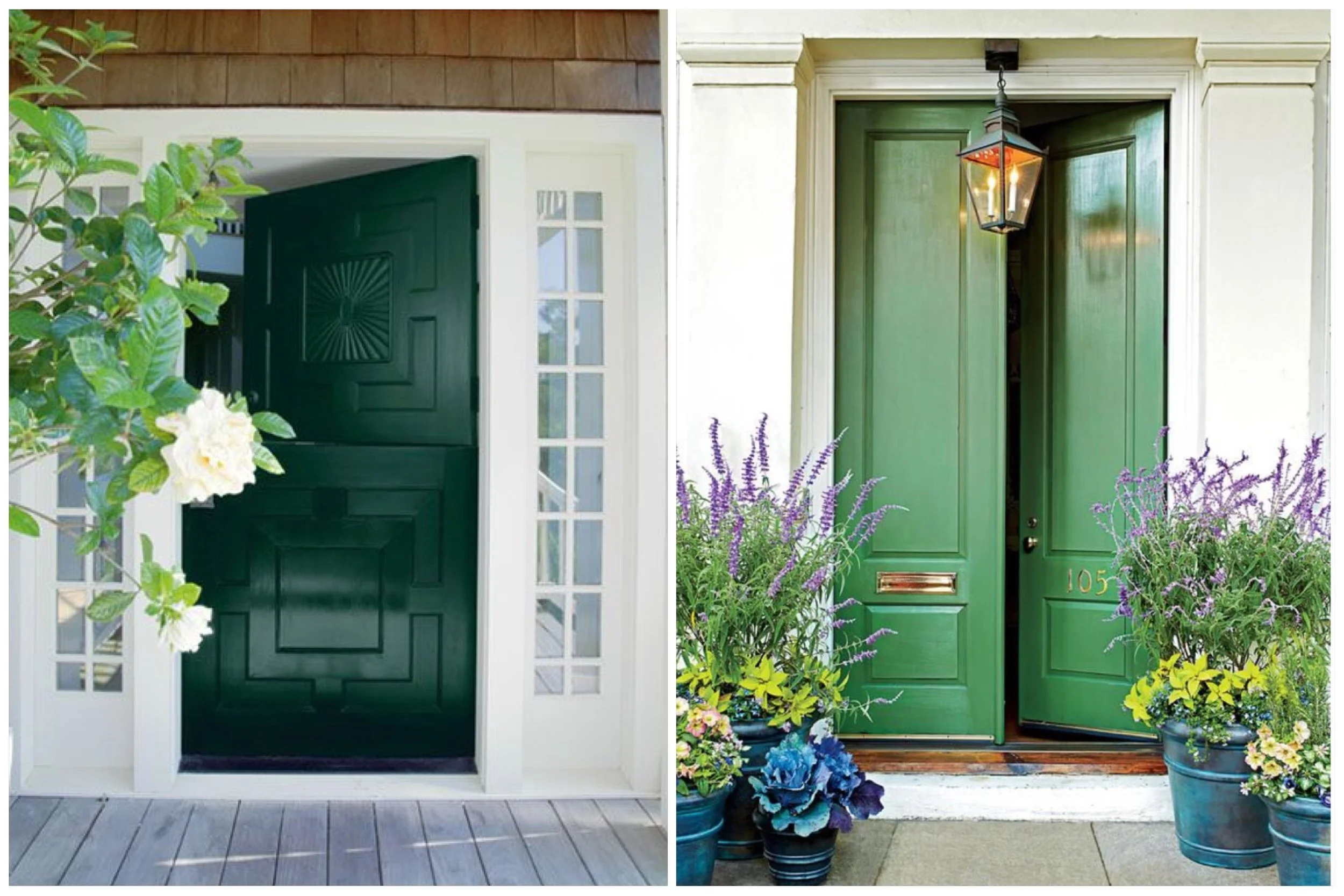
You may have heard how it’s not easy being green, but these doors make me think otherwise. Plus, that dutch door? Killing me. If you’re looking for more growth, balance and prosperity in your life you should consider going green. Some swatches I find complimentary are Benjamin Moore’s Absolute Green or Farrow & Ball’s Arsenic.
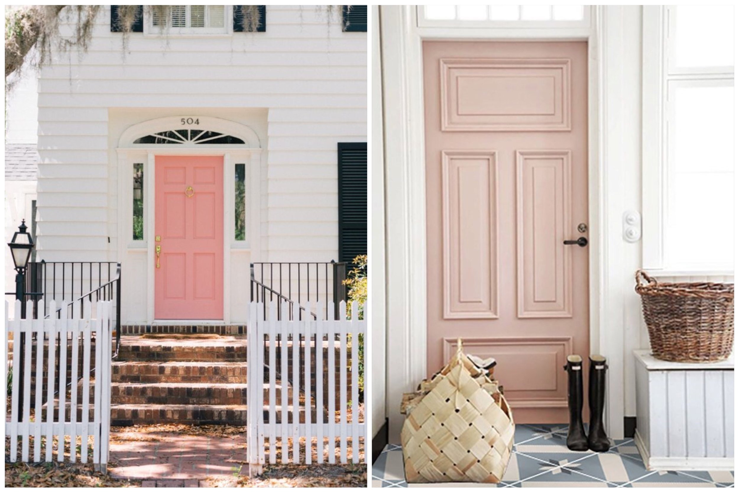
Now here me out you “millennial pink” naysayers, because I’m kind of here for this design moment. I mean if Wes Anderson can bathe an entire hotel in it, why not your front door? The color pink welcomes in friendship, harmony and inner peace. Take a glance at Benjamin Moore’s Mixed Fruit or Farrow & Ball’s Pink Ground. Come on, you know you want to!

Excuse me while I have a moment to relive my Roman holiday honeymoon as well as this moment when I stumbled across this gem. With little slice of modern in an ancient oasis, you couldn’t help but stop and stare, am I right? (It’s okay, I know I’m right) The color yellow represents optimism, enlightenment and joy. If you’re looking to try that on for size why not look into Benjamin Moore’s Bold Yellow or Farrow & Ball’s Citron.
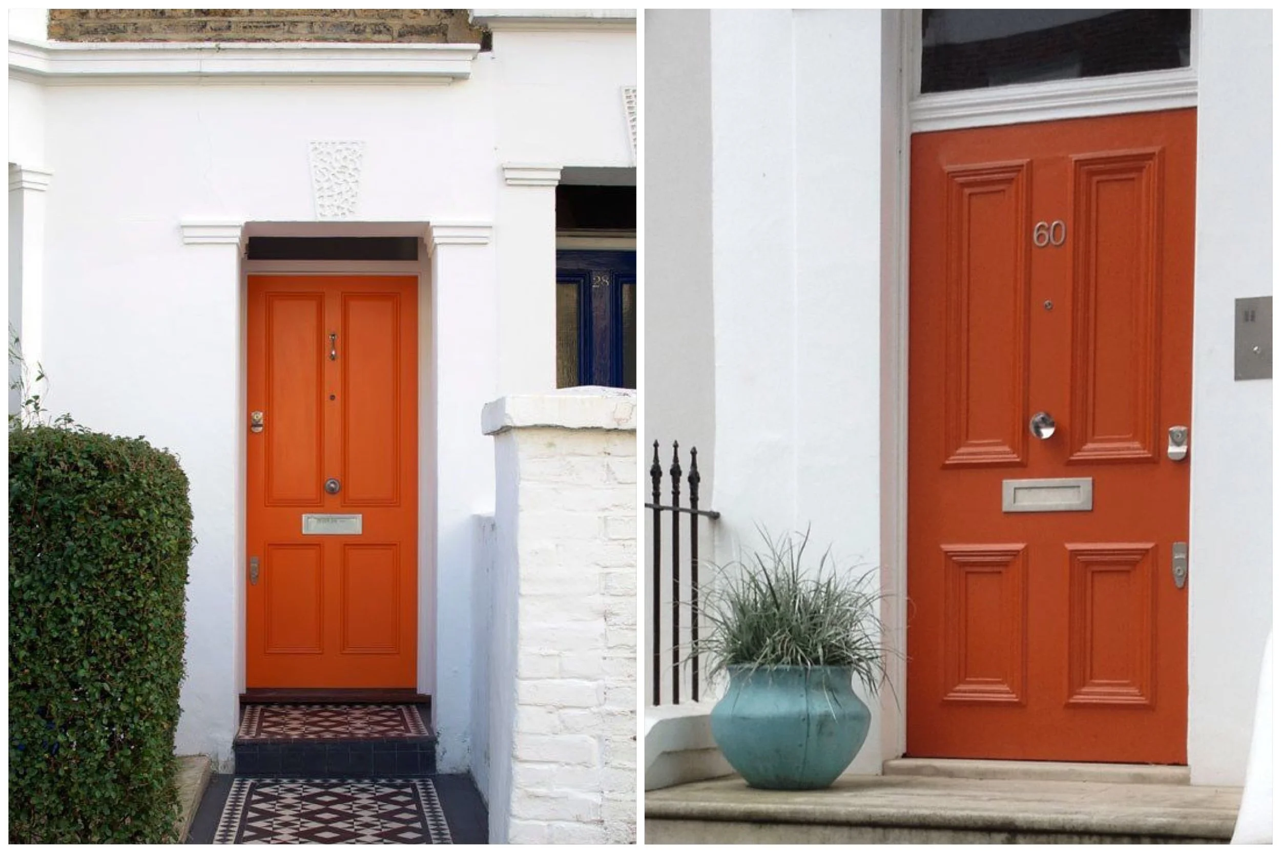
I get this sense that orange sometimes gets a bad rep. Just because there’s no other word that rhymes with it doesn’t make it any less of a great color guys! Personally at West End we’re really digging the burnt orange vibes. It’s said that orange is the color of adventure, risk taking and independence. Why not try Benjamin Moore’s Racing Orange or Dragon’s Blood (yes, I may have selected this for the name alone.)

Grab your painters tape, we’re about to get real funky. Now even though this isn’t really a color, I love this awesome use of a chevron pattern. Props to this fella who apparently only spent $50 to create this beauty. I mean, it really speaks for itself: eye-catching, artistic and youthful. Isn’t that an awesome kind of energy you’d like to welcome guests with?
No matter what the color, or pattern, you’d like to use on your front door, West End Interiors asks that you consider all the possibilities out there. Worst comes to worst, you can always paint it back to plain white if you’d like. We have a feeling that won’t be the case though.